Image Style Demo
While browsing Herman Martinus’s blog, I noticed an image style he added to the Bear Blog template. This style crops photos into squares and scales them down, allowing two photos to fit perfectly side-by-side within the screen width. This is ideal for creating a four-square gallery by placing multiple photos together.
I modified the hugo-bearblog theme to add this style. You just need to add one line in the Front Matter:
YAML
img-style: true
TOML
img-style = true
Here is the effect:
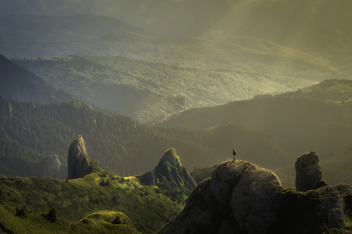
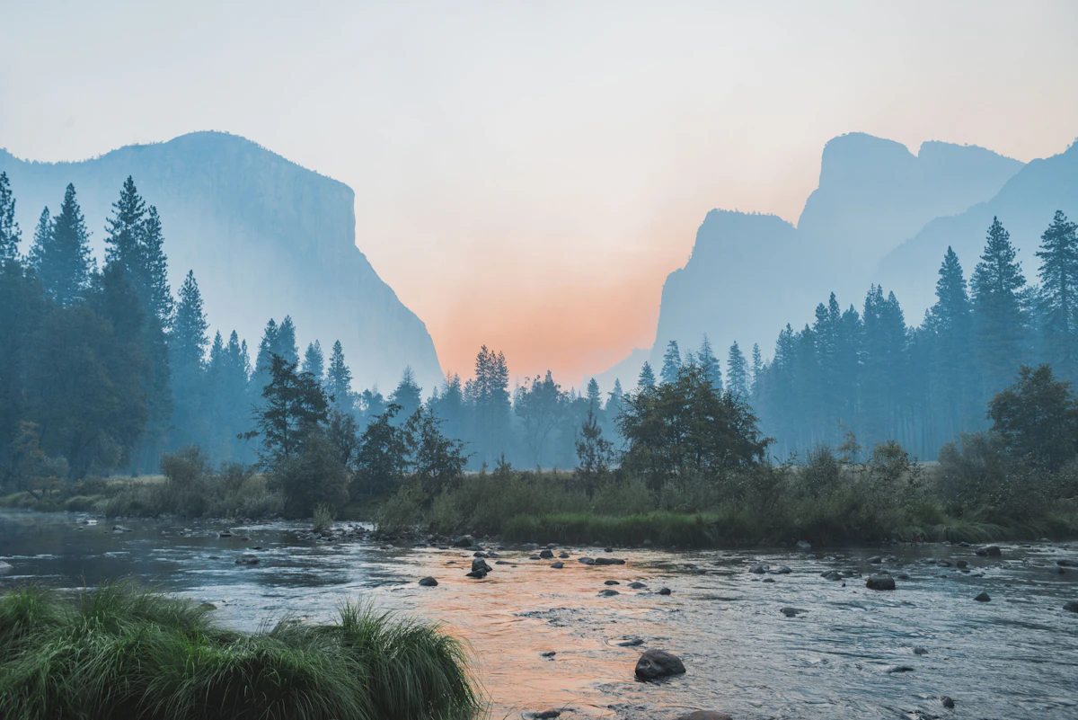
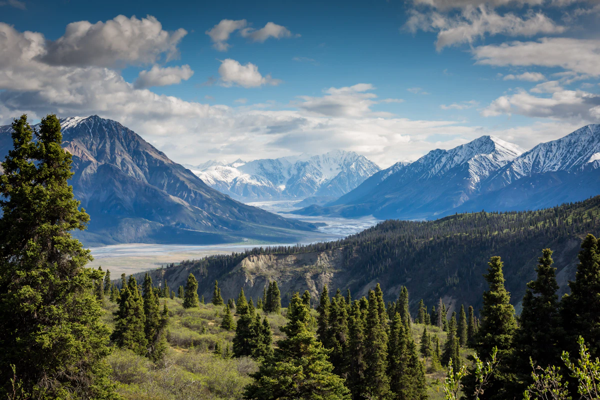
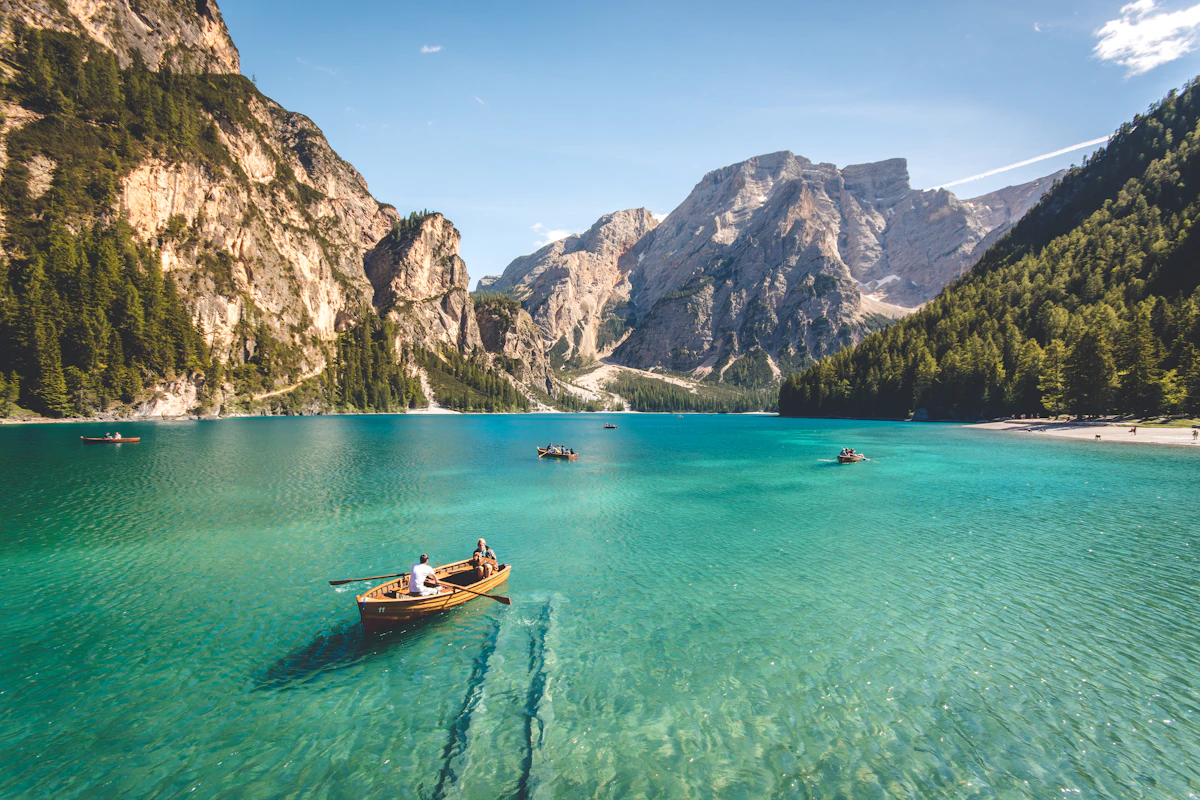
The above is a test demonstration.
Implementation Method
I added the following code to layouts/partials/custom_body.html:
{{ $params := .Page.Params }}
{{ $imgStyle := index $params "img-style" | default false }}
{{ if $imgStyle }}
<style>
img {
    max-height: 350px;
    aspect-ratio: 1;
    object-fit: cover;
    object-position: center;
}

@media (hover: hover) {
  img:hover {
    transform: scale(1.5);
    transition: 0.5s;
  }
}
</style>
{{ end }}